Sustainability

//////////
Client: World Bank
WAVES is a World Bank-led global partnership that aims to promote sustainable development by ensuring that natural resources are mainstreamed in development planning and national economic accounts.
We were tasked with refreshing existing comms, updating the brand marque and pulling together a set of guidelines to create a more engaging brand and a more homogenised look and feel across all the various publications.
We also created a series of illustrative grids to express the core themes of the programme.
Real Estate

//////////
Client: British Land PLC
British Land is one of the largest real estate companies in the world with a strong focus on using design to improve the lives of the people who occupy their spaces.
We have worked right across its marketing departments providing design support services to retail, luxury residential and office space.
Projects vary from brand roll-outs for a new building or campus to public facing hoarding design right through to B2B digital apps and internal HR comms.
Health

//////////
Client: Thrive Tribe
Thrive Tribe are a health and wellbeing organisation that runs a number of support programmes to improve peoples health through behavioural change, education and support.
28 Days is a high impact stop-smoking campaign that is helping people to stub out their final cigarettes across England.
If you manage to give up smoking for 28 days you are 5 times more likely to succeed. This positive message became the focus for the naming and logo (plus one of our favourite films is 28 Days Later).
Community

//////////
Client: Brighton & Hove Food Partnership
We have worked with the Food Partnership for many years initially reworking their brand and creating robust guidelines that have really stood the test of time.
An exciting new development for the Partnership was the Community Kitchen which is based right in the centre of Brighton. The Kitchen offers cooking and nutritional classes with the paid for courses funding the community courses.
To strengthen the Food Partnership’s brand recognition in the city we created a new logo lockup, colour palette and illustration style. Plus some pretty amazing windows.
Charity

//////////
Client: Oxfam
This was the first piece of DM to be released in the refreshed Oxfam brand so there was a lot of responsibility to get this right.
We had to take the newly fledged guidelines and create a cohesive, creative response which had to live up to Oxfam’s strict criteria for ROI.
This project involved everything from concept, ilustration, long copy and creative copy, plus collateral design and fulfilment.
With such a high profile charity and a nationwide door-drop we were particularly focussed on tone of voice. We wanted punchy but without alienating potential donors.
Fashion
//////////
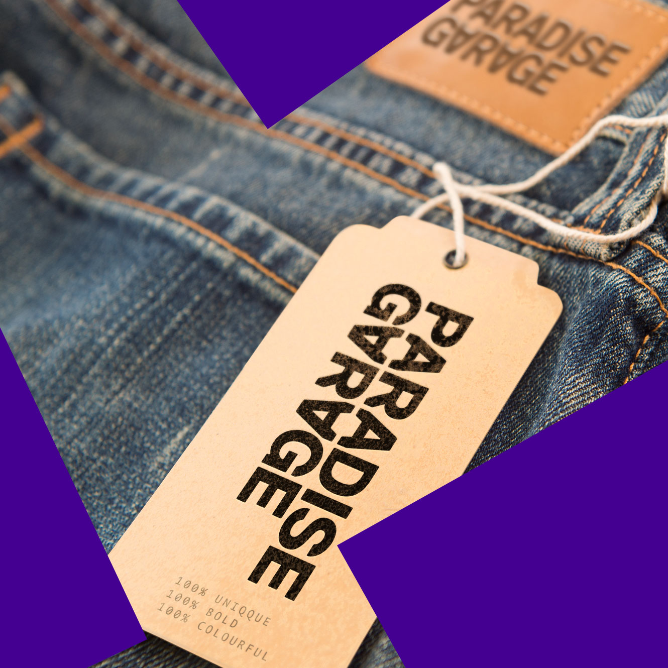
Client: Paradise Garage
We recently completed the ID for this unconventional multi-brand luxury boutique that has just opened its doors in Paris.
They are offering something different for men in the capital of understated chic with their curated range of high-octane, kaleidoscopic and gender-fluid designers with a focus on print.
We created a modified typeface for the logo and literally turned things on their head to express this store’s bold and revolutionary attitude.
Needless to say the colour palette is black. It’s Fashun darling.
Technology
//////////
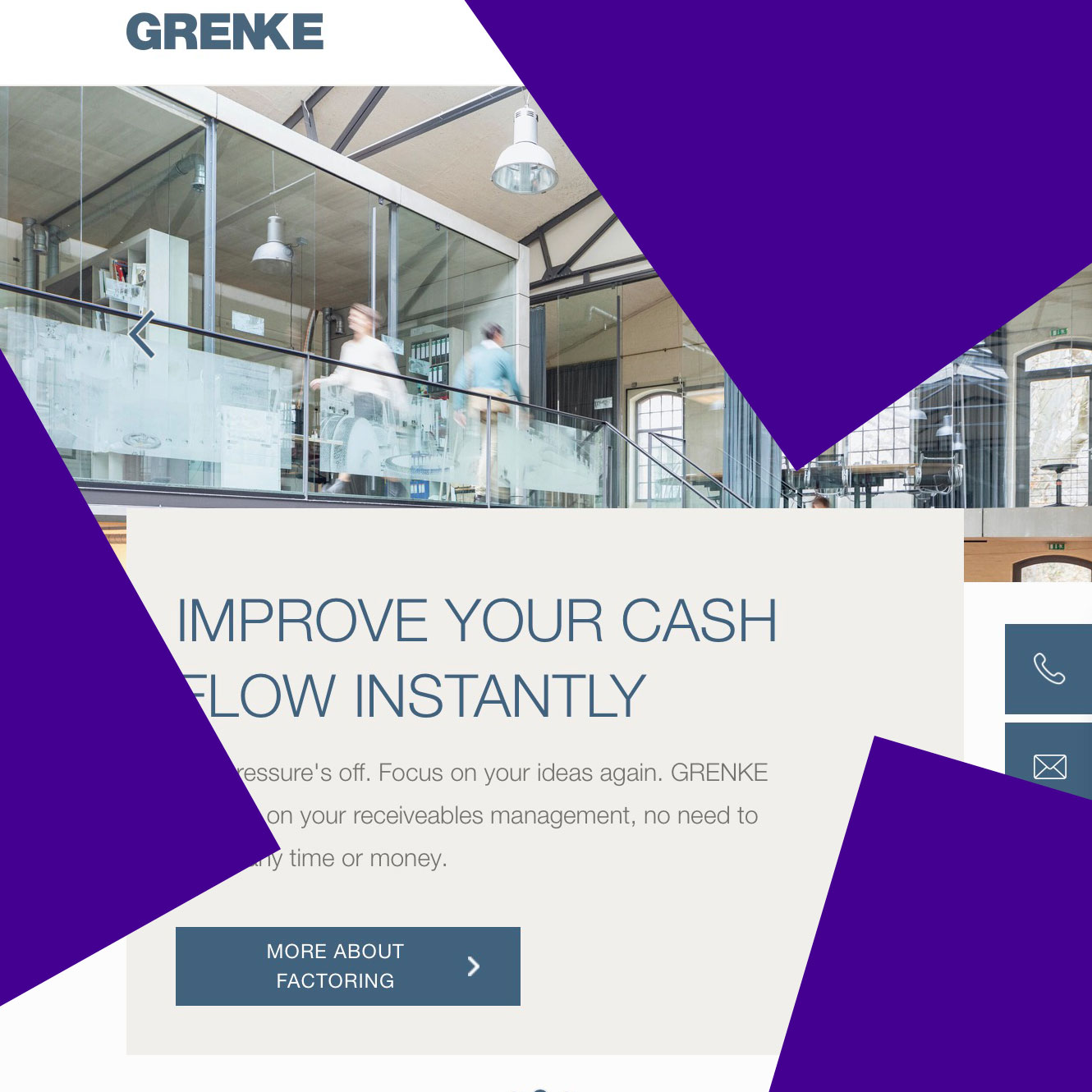
Client: Grenke
GRENKE help customers all over the world to develop their business through finance products and technology leasing solutions.
We were tasked with helping the development of their English language website as part of the roll-out of a new digital look and feel.
We conducted a digital brand audit of language, tone of voice, imagery, information architecture and user experience.