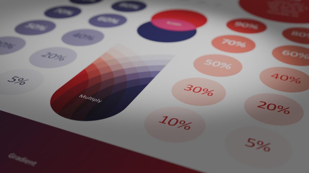
A secondary palette gives flexibility and content delineation
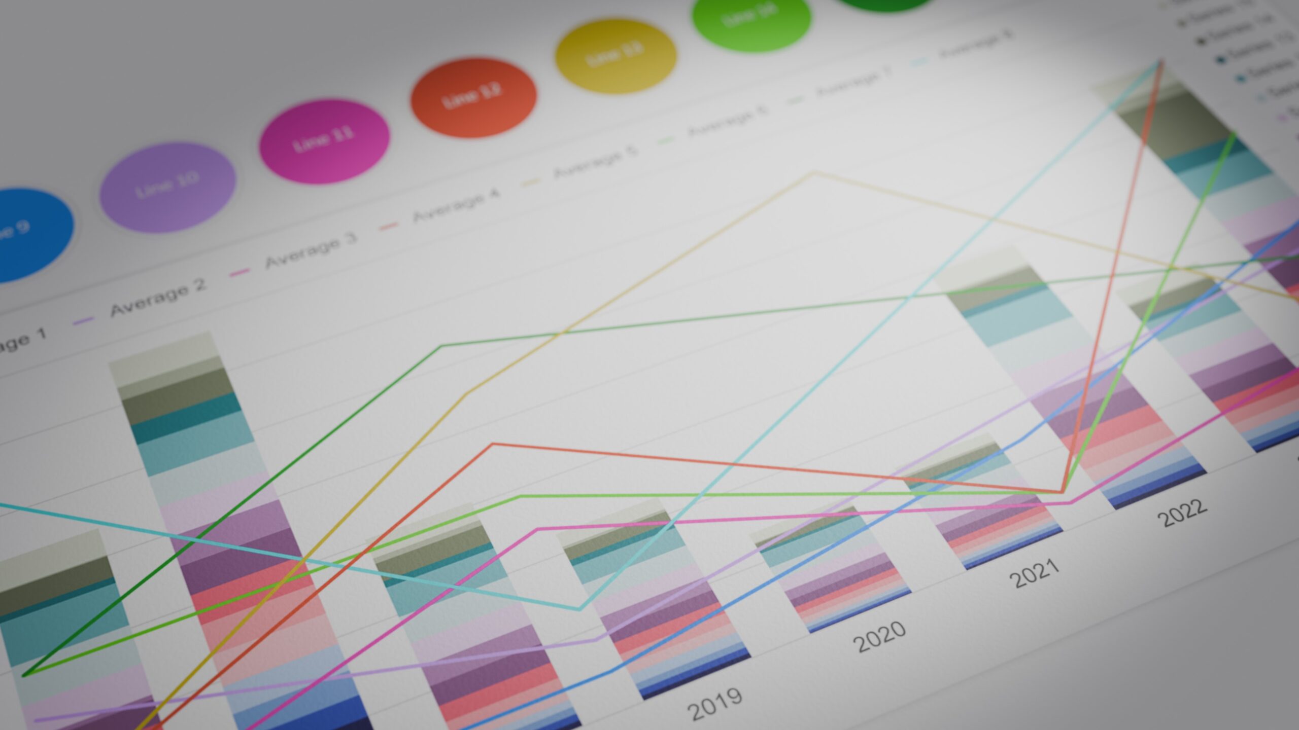
A tertiary palette is for very complex data
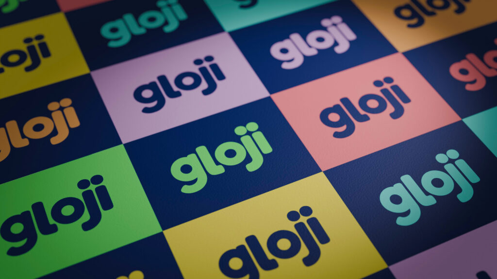
We design colour systems that combine aesthetic sensitivity with strategic rigour. Bold or restrained, we’ll guide you to the perfect palettes for your project.
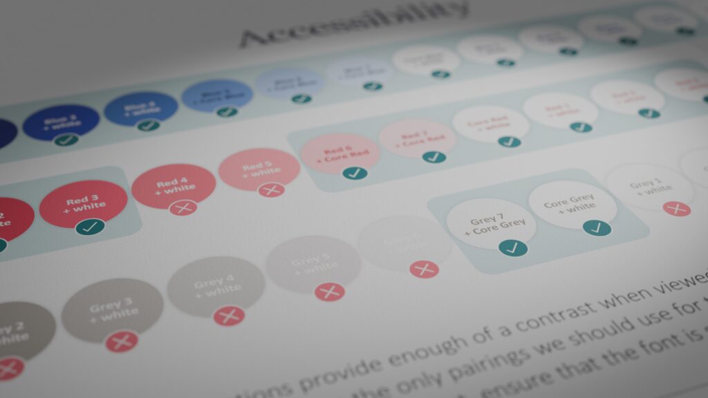
Accessibility
Brand book showing accessibility do's, don'ts and workarounds
Accessibility is integral to how we work with colour and branding. Whether you’re working to AA or AAA standards, we know how to balance compliance with style.
Keeping things consistent
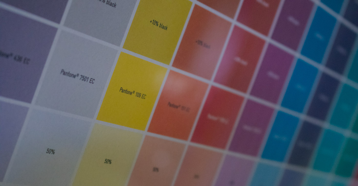
Wet-proofs are used to test your final palette on a specific paper
We lock down your colour palettes with care and precision, including rigorous screen and print testing. Our wet-proofs are so lovely that people frame them!
Beyond page and screen
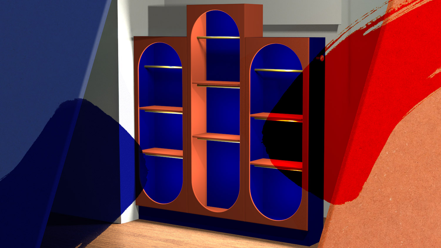
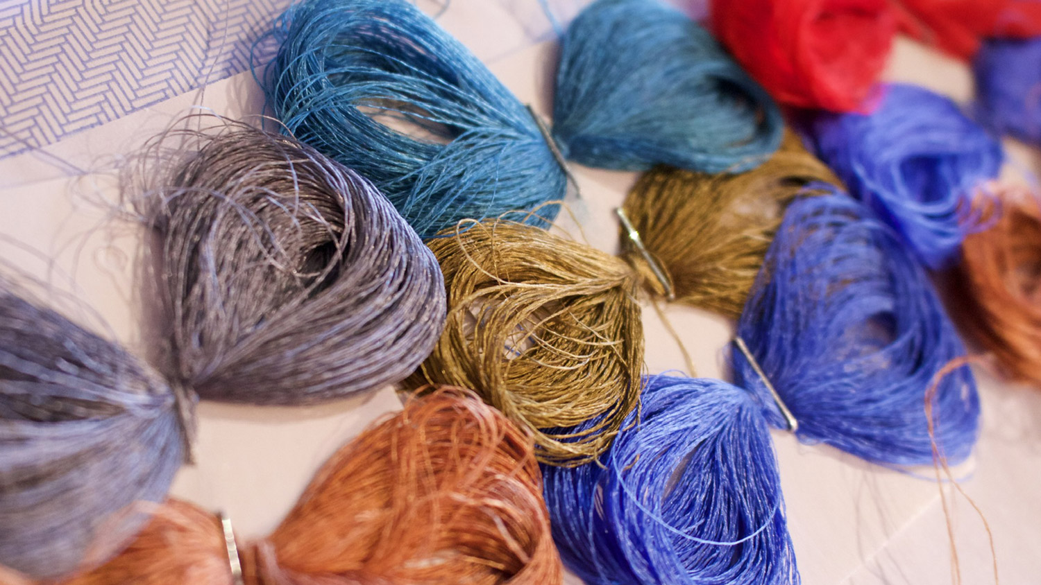
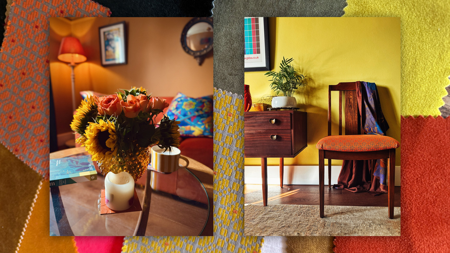
The world is far too dull… to beat the beige we also apply our bold sense of colour to interiors, furniture, product design and textiles. If you want to collaborate, get in touch.